PexNano: Brand identity and website for a scientific equipment line
Role:
Brand identity, art direction, copywriting, content structure, web design and build
Client:
Photon Export
Year:
2024
Timeline:
2 months

The brief
PhotonExport was adding laboratory equipment to its catalogue, laminar flow cabinets for cleanroom environmental control and sputter coaters for preparing SEM and TEM samples, and wanted the line launched under its own brand. Nothing existed yet. The identity had to be complete in two months so the sales team could open the line, and it had to read as an established supplier from day one, because the buyer was a university researchers whom an unfamiliar name is a purchasing risk.
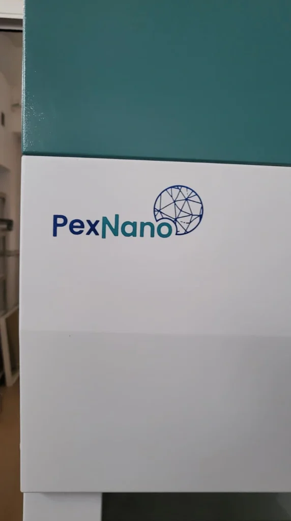
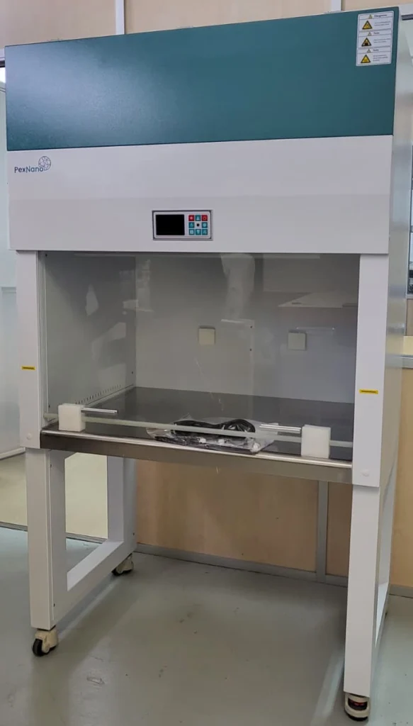
Two constraints set the shape of the main logo. It had to be an endorsed sub-brand, visibly tied to the parent. And the mark had to be physically applied to the equipment, at maximum dimensions specified by the factories.
And the brand needed a website at launch, since a researcher evaluating an unknown supplier goes looking for one before they enquire.
The concept
Usually scientific branding defaults to atoms, molecules and flasks. For PexNano I decided to focus on what one of the main products does. Allows you to see the surface of a material at very high magnification.
With sputter coaters what researchers are able to see are highly magnified view of a surface, and at those magnification levels ordinary materials resolve into intricate, genuinely striking patterns. That image is the reason the equipment gets bought.
So the mark itself is built from the surface of a material, the pattern you actually see under SEM. It shows what the product does rather than what industry it belongs to.
The construction of the logo then borrows from PhotonExport. The new mark keeps the same layout as the parent logo, wordmark and symbol in the same relationship, so the two sit side by side and read as related.
The decision
Several pattern routes were developed. The one that shipped was not the most detailed. It was the one that still read cleanly at the size the factories had specified for application on the product.
The physical constraint decided the logo. Anything that only worked on screen was out.
The website
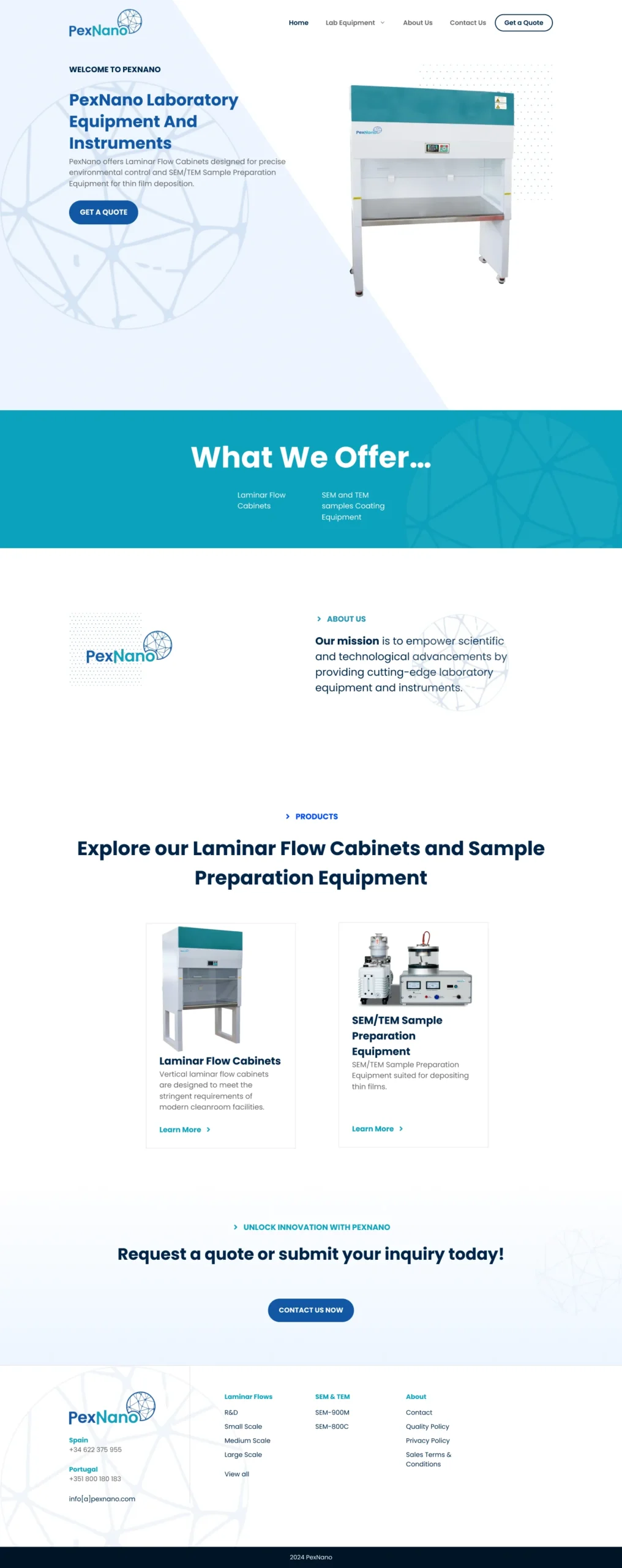
The PexNano website is a standalone WordPress site, designed and built end to end.
I wrote all copy and set the page structure. Working through each product with the engineering team, we established what a buyer actually needs in order to decide, and built the pages around it, with full technical specification kept below. We started from the complete spec sheets the factory supplied and distilled them down to what mattered most to the reader.
We also sourced product images for each page, so the reader could see the equipment as well as read about it.
Every product page ends with its own enquiry form. So if you’ve just read the spec and it fits what you need, you ask for a quote right there.
That matters because the enquiry is really the only conversion event on the site, and it happens in one narrow window: the moment someone decides this is the right product.
If you were to send them off to a generic contact page, they lose a click, they have to re-explain what they were looking at, and they get a pause. And in that pause, buying turns into something they’ll do later.
Keeping the form on the page means the decision and the action happen together. Plus every enquiry comes in already attached to a product, so sales knows what’s being asked about before they even reply.
View the live site: PexNano
PexNano Product shots